Saturday 10 May 2014

Focus Group Feedback

Here are the main findings/conclusions of our audience research. The only details that members had to give us about their identities were their ages and genders, we hoped that this would stop feedback from being biased as we wanted honest opinions.


Question 1:
Please list 5 scenes/shots that you found the most memorable from our trailer
.

Answers
Tally
Rape scene
9
Gas mask/table card scene
3
Boy reacting violently scene
7
The hanging scene
9
Doctor argument scene
1
Train scene
4
Patient "Shhhh" scene
1
Knife to man's throat scene
5


Establishing shot
3
Blood in sink
2

We were pleased that the two most harrowing scenes in our opinions had also had an impact on the audience. We weren't surprised by any of the answers as they consisted mostly of shocking content which we expected them to remember, we were glad that the audience remembered and responded to these scenes as they were constructed to provoke a response.


Question 2:
How did the trailer make you feel? Both physically&emotionally?


We were pleased that the trailer seemed to evoke physical/visceral pleasures in our audience. Five members stated that the trailer made them feel as though they were "On the edge of their seats," which was a really successful response as it showed that the trailer was effective in building up suspense and tension.

Question 3:

Please give your interpretation of the plot synopsis, and the genre which you think it represented.


All nine members successfully identified the genre, with 2/3 identifying it as a psychological thriller. Our trailer was designed to have more characteristics of a psychological thriller from the beginning due to the complexity of the code of enigma and the mental illnesses involved, so we were really pleased that it was obvious to our audience.

Individual answers on plot synopsis:
1)      Girl raped, baby given to father to turns him into a patient within the mental asylum, when a doctor arrives and helps the patient.
2)      Mental asylum, patients go off the ropes, causing distress to the owner. The baby was possibly brought up in the asylum?
3)      Based in an asylum, mental patients, and abnormal happenings.
4)      Asylum, story based on the young boy.
5)      Mental institute, patients are abused and everything starts getting out of control, whilst trying to reconnect the mother with her son who is the patient.
6)      A nurse is raped by an unknown individual, who then becomes pregnant. Too ashamed about the whole situation, the child then stays in the mental asylum where he is brought up and becomes mental.
7)      Rape in mental hospital results in a baby being given up and raised as a patient.
8)      Mental institute set in the past.
9)      The nurse was raped and her baby grew up in the mental asylum. The baby was not treated very well and had a mental breakdown.


These responses proved that our trailer did have a clear narrative, telling a story to our audience. However, it did not give too much away as our members still questioned who the "Unknown patient" was, and how far the head of the asylum went with the mistreatment of his patients. The boy's father is never revealed in the trailer and neither is the murderer who washes blood of their hands.

All of our members replied "yes" to whether they would be interested in seeing the full feature film based on our trailer.
We also asked them to give reasons, for which answers included "it was intriguing," and "wanted to see what happens at the end."

Question 5:

Six members replied that it was aimed at over 18's due to adult themes, whilst 3 stated they thought it might be aimed at 15 year- olds due to the fact that the vast majority of films in this genre have 15 certificates.
Question six: 
How well does this trailer compare to real existing film trailers?
Please give reasons.

1)      It is similar to real horror film trailers and is set up well to look like a real trailer.
2)      Well because it grips the audience.
3)      It had a good, gripping atmosphere but the acting could have been better.
4)      I think it sums up to a real existing trailer. The trailer pointed out some of the main features from the film, just like the real trailer. The trailer is also intriguing just like real life trailers.
5)      It had a good atmosphere, thrilling, keeps you on the edge of your seat, interesting, a bit too long but very informative. Good use of music.
6)      I think this trailer is unique compared to others but would fit in with existing trailers. It is a really good trailer including good transitions/soundtrack.
7)      It was very good. Provided the necessary information for the audience to understand the plot but not enough to give away all the details before watching the whole film.
8)      I think it was really good because like professional trailers it built up the suspect well throughout. I think the atmosphere it created was brilliant.
9)      A bit muddled up at times and needed some fuller explanation, however left me wanting to see more which is more than can be said for most current trailers.


These responses showed that the majority of people agreed that it would compare well with real existing film trailers, and pointed out parts of the film trailer which could have been improved. This has helped myself and my group to understand how we could've improved it which will help us in the future, as we were grateful for both criticism and positive comments.

Audience Reactions: Enclosed Trailer 2014


We conducted a focus group of nine students after completing our trailer, to find out some initial reactions. We gave each member a short questionnaire to fill in some of their reactions, we felt this would be effective in case they felt uncomfortable voicing their true opinions, allowing them to write them down instead. We played the trailer twice to try and see if they grasped an understanding of the plot, this video shows their reactions on the first viewing of the video.

Enclosed - Official Trailer (2014)

Thursday 8 May 2014

How did you use media technologies?

What have you learned from your audience feedback?

How effective is the combination of your product and ancillary texts?

Evaluation Question One

Process continued....


I decided that I need to change the image and effect of the building and gates itself in order to make the background appear scarier. 


I tried changing hues to change its appearance, this for example has a slight hint of a red hue. I liked this but still felt it wasn't strong enough or scary enough to create the unsettling effect which I wanted.


This was my eventual outcome, which I was much more pleased with. I added some different black and white effects, as well as a "smoke" and "grunge" effect. I added a vague hint of blue smoke to distort the colours , which made the centre of the image a lot more striking. The other smoke effects then created a stormy/cloudy image in the sky which enhanced the overall theme of it being set in Winter and looking offputting. The key reason for the focus on the gates looking so intimidating lies with the concept of the film and its title of "Enclosed." In order to link in, the building needed to resemble a place where any viewer would dread being trapped in.


Filming Process

Throughout our filming we have adapted and added a number of shots since our initial sotryboarding.
  

We have remained consistent with the portrayal of the rape scene, sensitively handling it so that not too much is showed to the audience. It still remains implied, and we have changed some camera angles to make it appear as though Cecilia is being watched from the start. By filming from behind a screen we created a half-exposure shot to make it look as though the attacker is hiding somewhere, peeking through to watch her before the attack. This created tension effectively, as did the slow shot of her preparing her nurses tray with equipment , which made it more sudden and shocking when she was grabbed , and everything fell to the floor. The audience watches her from the attackers viewpoint as she walks down the corridor and enters the room making it more eerie and tense.

The rape scene has been filmed so as to show only below the legs which move, giving a clear implication but not showing anything explicit, there is also a sound effect of heavy breathing used to further the implication.
We added an improvised shot of a butterfly slowing moving along the window pane to contrast something beautiful and innocent with the attack which is happening at the time.

After this, we shot a scene of Cecilia sat on the floor distressed, she says the lines "Lord Jesus, please forgive me of my sins." This clearly presents the religious emphasism of the establishment, as her immediate reaction is to prey. It is also saddening as she clearly feels that she has committed a sin, or what has happened will be percieved a sin, even though it is not her fault.

We kept to the main idea of the interview scenes with Sean, however we did cut down dialogue as we felt that there was too much , and in the end it wasn't necessary as long as we presented that he didn't know who his parents were. We were futher able to emphasise this by the creation of a legal document showing that Sean's father was unknown, but that Cecilia was known to be his mother. Through this sequence we added the train station scene so that the audience could make the link that Cecilia was his mother, being sent to a nunnery by the head of the asylum. We used a doll to show her handing the baby over and then the transition of a train to show she had gone.

Some of our improvised scenes were created as we were able to find useful props which we previously did not know we'd be able to have access to. For example, we have used a dummy figure of a man dressed in old clothes. His body was realistic and so we have used careful shots to display him as a patient. We used a wheelchair to show him being wheeled down the corridor by a nurse, and a montage shot of another patient getting angry at him, throwing all the playing cards off table at him angrily. We also used him as one of Sean's victims, hanging from a rope in the sheds which looked abandoned and eerie.

We used a lot of canted angles in order to represent distortion, particularly when filming the head of the asylum, as this distortion is mirrored in his personality. We hoped that this would help the audience identify his evil nature early on.
We do however see parts of him being more human, for example looking stressed and stroking the photo of his family.
We have portrayed him overall as very sinister however, with the use of facial expressions and dialogue.

Age Rating Research


For my film trailer I started researching age ratings that would be appropriate for it, as most horror films have age ratings of "15" and "18" due to violent content I knew that my own trailer would fall into one of these categories. I went onto the BBFC website to source information on what would define a 15 and what would bring the age rating upto an 18.

I found that:


What might I see in a 15 rated film or video?

Any of the following:
  • strong violence
  • frequent strong language (e.g. 'f***').
  • portrayals of sexual activity
  • strong verbal references to sex
  • sexual nudity
  • brief scenes of sexual violence or verbal references to sexual violence
  • discriminatory language or behaviour
  • drug taking

How much strong language is allowed in a 15?

There could potentially be a great deal. At 15 there is no upper limit on the number of uses of strong language (e.g. ‘f***’).
Occasionally there may be uses of the strongest terms (e.g. 'c***'), depending on the manner in which they are used, who is using the language, its frequency and any special contextual justification. However, continued or aggressive use will not normally be passed 15.

What about discriminatory or offensive terms?

There may be racist, homophobic or other discriminatory language, and the work could explore themes relating to this.
However, at 15 the work as a whole must not endorse discriminatory language or behaviour.

How much sex and nudity is allowed at 15?

At 15 sexual activity can be portrayed, but usually without strong detail. Some sex scenes can be quite long at this category.
Though nudity may be allowed in a sexual context there will usually be no strong detail. There are no constraints on nudity in a non-sexual or educational context.
There can be strong references to sex and sexual behaviour, but especially strong or crude references are unlikely to be acceptable unless justified by context.

Sex and sex references are treated the same irrespective of sexuality.

What about sexual violence?

There may be detailed verbal references to sexual violence (for example descriptions of rape or sexual assault in a courtroom scene or in victim testimony) but any portrayal depiction of sexual violence must be discreet and justified by context.

In an 18 Film....

Are there any limits on what sort of theme a work can have at 18?

No theme is prohibited at 18. Adults are free to choose their own entertainment provided the material is not illegal or potentially harmful, so it is possible some themes tackled at 18 may be offensive even to some adult viewers.

What sort of issues might I find in an 18 film or video?

18 works are for adults and can contain strong issues such as:
  • very strong violence
  • frequent strong language (e.g. 'f***') and / or very strong language (e.g. ‘c***’)
  • strong portrayals of sexual activity
  • scenes of sexual violence
  • strong horror
  • strong blood and gore
  • real sex (in some circumstances)
  • discriminatory language and behaviour

How much strong language can there be in an 18?

There is no limit on the number of uses of strong (e.g. 'f***') or even very strong language (e.g. ‘c***’) which can be passed at 18. Uses could be aggressive, directed, frequent or accompanied by strong violence.

What about discriminatory terms?

There may be racist, homophobic or other discriminatory language at 18, and the work could explore themes relating to discrimination.
Though a work as a whole must not be in breach of any relevant legislation, it is possible for discriminatory language or themes to be the main focus of the work, and for main characters to engage in discriminatory behaviour.

How much sex and nudity is allowed at 18?

There can be strong and detailed portrayals of sex at 18, including full nudity. There are no constraints on nudity in a non-sexual or educational context.
Very strong, crude and explicit sex references are permitted at 18.
An 18 film or video might also contain depictions of real sex, as long as the film or video is not a sex work.

Can there be strong violence?

Yes, at 18 violence can be strong and be portrayed with strong detail. There may even be dwelling on the infliction of pain or injury, or scenes of strong sadistic or sexual violence.
The strongest gory images are permitted at this category

After reading these guidelines I have concluded that the full film feature overall would have to be classified as an 18 production, due to the rape scene and the strong portrayal of violence (eg. someone hanging.) However as the trailer only presents the implication of rape without nudity, only showing the legs of the characters, and does not show any strong gore/contain bad language, it is more accessible by a wider audience.


Wednesday 7 May 2014

Poster Version 2


After some extra editing I finally managed get my second poster image to fit my template the way I wanted:


In this I have changed my billing block to white to make it more readable and clear, and have edited my tagline font to make it stand out more. I have also enlarged my title and exaggerated the size of the first and end letters.


The above is my preferred draft as I feel that the image is better and blends better with the background, the scratching effect also makes it have a flickered / distorted effect, almost as though on a television screen.


Feedback

I gained the following feedback on the first draft of my film poster: 

Classmates liked the font and style of my title text, and the stroke effect in deeper red colouring. They felt that it was reflective of a horror film title branding and mirrored real life textual examples. They also liked the tagline and its connotations, my group members were especially able to understand its underlying meaning. I was happy however that the rest of my classmates were also able to work out the meaning behind it and connect it with Cecilia's character.
They also liked the conventional style of the billing block font and the social networking logos etc, but suggested I could perhaps have some additional logos such as production company or picture house name.

Some class members suggested that the poster was not striking enough as a horror poster, in that the image did not visually scare them , or wouldn't if they were only able to have a short moment to glimpse at it. I agreed that something extra was needed in order to create a more effective response. I had shown them the poster for "the devil inside" during my presentation as one of my poster inspirations, due to the similarity of the nun in the image. 


The nun in this poster is clearly unsettling due to the effect in the eyes and the scratched effect on the image , complimented by the red colouring on the right hand side of the poster which adds to the horror style. I thought about maybe applying some of these ideas to my own poster to enhance the visual response to the nun.

Classmates also suggested that I try adding an image of Sean (the boy) behind the asylum gates in order to make him look like a ghost locked behind bars. I liked this idea but my only concern was whether the image of the boy would fit properly behind the gate and whether I could get it to look realistic enough using photoshop.


Tuesday 6 May 2014

Final Poster Versions


This second version uses the suggestions given by my teacher and classmates. I personally however feel that the fist version is more effective, will clearer use of editing and photo quality.

Friday 2 May 2014

Final Magazine Cover


Here my magazine cover features conventional items, such as:
-barcode
-issue number&date
-additional images
-film related coverlines
-masthead
-bold main story
-2 "splash" features


Thursday 1 May 2014

Drafting Magzine


Without additional images, or a barcode to add authenticity....


With additional images&barcode, but still needing some re-arrangement and editing.

Edited photos for magazine


I edited the photographs of Harri to improve their appearance. I constructed them using a theatrical sceen background which was a physical piece of set at the drama centre. I felt that the wallpaper design on it fitted in with the theme and style of the asylum; being set in the past. I wrote, "RUN" onto his hand as if it is a warning to readers, or anyone entering the asylum. The word is written on his hand, which was positioned into a "stop" pose, to further give the impression of a warning. I edited the photo to make the edges darker, so that coverlines would be easier to add and stand out more. By raising the contrast why the shadow was also emphasised creating a better overall visual effect. 


In this second photo I made the contrast even higher and added saturation to bring out the colours more. In this I added a rain effect,as well as smoke to add to the horror effect, it also made his cheekbones more prominent which highlighted his scared/shocked expression. 


I then created a photo collage to add to my magazine cover, using an effect which created borders, making them appear like polaroid pictures. I wanted to do this as a neat method for adding additional pictures, which wouldn't obstruct my main image. I used edited photos which  had horror themes, such as the asylum gates and someone being dragged down the corridor. On the image of Meg being dragged, I Edited using a 3D and blood effect to change the appearance, as it looked to plain alone.


Tuesday 22 April 2014

Animatic Evaluation

A Critical analysis of the Animatic Process

A movie animatic is the process of creating a preliminary version of still photos which are representative of the necessary moving images for the actual film. In this case, we have created an animatic for our film trailers to mimic this process. Its function is to allow the filmmaker to plan how each shot will be angled and positioned, and how long they will last for.   The filmmaker can then see whether their ideas are realistic to shoot, and see visually if it appears in the way that they want to. The sounds, music, and inter titles necessary are also added in the same positions as they would be in the real trailer.

After creating our original storyboard, we re-drafted certain shots as a result of discussing them in more realistic manner and concluding that they were unnecessary. We realised that some of the “montage” shots were not entirely relevant to the main plot and so we decided to take them out of the storyboard. We drew up a few replacement shots which were more relevant and realistic to shoot. We then also decided to leave a few and decide on multiple extra shots after visiting our location for a longer period of time, and deciding which rooms would best represent the settings in our trailer. We also needed to plan whether we would be able to get hold of any props from our storyboarded images. Though we realised that we did not need to use all of the props and costume just for the animatic, we thought that certain ones might enhance it, and give us a better idea of whether certain shots would work or not.
We took our storyboards to our filming location so that were able to use it for reference when taking our photos. We began trying to take photographs in the same order as seen on our storyboards, which worked effectively when taking the photographs of the “psychiatrist” and the “patient.” However it was soon obvious that we would need to set apart the flashback scenes, and the scenes of “present day.” We did still continue to make reference to the story board however, ensuring that we followed the sequence of events. Using it enabled us to identify that one session would need to be done at the train station, but the rest could be done at the actual main location. Sometime would need to be taken to photograph the exterior of the building, but nearly all shots could be achieved inside.

We had approximately five shoots to complete the animatic. The initial was purely to choose the best rooms to represent each setting, and to take more shots of the location for the animatic rather than any action. Another was used to photograph the train station scenes, and the remaining shoots were used to photograph the interior of the building with our actors. Our animatic only used two locations as our trailer is focused on the “asylum” and the only alternate setting is the train station, used for the flashback. Though the building we use for the “asylum” is only a singular location, it is an extremely large building in which there are many rooms we were able to use to represent different settings, for example, a conference room and a chapel.  We did not use all of our costumes, but for the “Psychiatrist” we used smart clothes to make him appear professional, and we also used a nun costume for the mother to symbolise the religious aspect as she gave away her child. For props, we used a saw, and a mask to represent the obvious violent themes. We also used a religious necklace, similar to rosary beads , a nurses tray, jug of water and packet of tablets to administer to the patient. We also positioned furniture in the rooms of the building so that they reflected our desired settings, for example we arranged the photograph of the psychiatrist confronting the head of the asylum, so that the desk made him look powerful beneath the stained glass windows.

Choosing our actors was initially difficult as the characters in our trailer are fairly complex individuals. We used Harri as the “psychiatrist” as he understood exactly how the character would behave, and would be frequently available for filming. We asked students in the sixth form whether they would be willing to act in our trailer and had interest from many of them. However, we had to take into account whether certain people would be mature enough to take the filming process seriously, and who would be available at the times we were in order to shoot. We knew a fellow student (Sean) who was a young male and willing to play the part of the “patient.” As he is a confident person, we felt that he would work well as that character. We knew that casting the part of the mother would be difficult as the actor would have to portray serious themes and issues, but Emily understood what she would have to act and was happy to take part. She was also happy to give up her time in order to be photographed. We also used Lwci and photographed her as an extra patient to portray the horrible things which happen at the asylum. The “Head of The Asylum” had to be an older, visibly adult male. We deliberated over using a student but concluded that it wouldn’t be realistic, so Harri’s father offered to act that part, making it more believable. Meg was also used an extra for one of our montage shots, depicting horrible happenings at the asylum.

The one shot we were unable to take was a shot of numerous patients in the asylum. When storyboarding, we ideally wanted a shot of a large number of “patients” sat in the canteen to clearly establish that it was home to many mentally ill people. This was difficult to organise purely for the animatic however, when it comes to actually filming the trailer we plan to organise people weeks in advance to walk down to our location during free periods.

The masked shots and the shots with the saw were improvised according to the props we could make available to us. We decided that they would obviously represent a horror theme well, and that there needed to be shots of the patient being violent toward other patients/ the psychiatrist. We also added some shots of the patient posing in different ways, in different rooms, which at the time we had not thought of when drawing the storyboard.

We used the editing suite to bring together all of our photographs and construct our trailer in animatic format. To do this, we first looked through all of the photographs and chose only the clearest, best positioned pictures. We then put them in order on the editing programme, and added some inter-titles. Lastly we cut each shot to its desired length and added music soundtracks to accompany them.
We had pre-organised the timing of each shot after creating our storyboard. We got to work shortly after producing it, deciding collectively on how long each shot should take. This meant that when it came to editing our photographs we instantly knew how long each would take. We took into account what was happening in each shot, and any significant objects/actions which the camera should linger on.
We used simple titles for our animatic which may later be changed or substituted. They do however, convey the messages we hope to reveal to our audience, and we felt that they did reveal too much of the plot, but reinforced the code of enigma.

I personally felt that the music used in our animatic was really effective. As a group we spent about an hour searching for non-copyrighted music online which would suit the theme of our trailer, and emphasise the horror genre. From our research, it was clear that the music in horror trailers play a large part in creating tension, fear, and building up the “shock value.” Our animatic uses three different soundtracks and hopefully accompany the shots they play under in an effective way.  For example we have also cut the lengths of the soundtracks and made sure that precise images match precise sounds, at the end, the sound of a loud bang matches the shot of the closed door of the asylum, to reflect it being slammed shut.

Our completed animatic features many images representative of the horror genre, which should attract our target audience. The unusual setting, combined with unsettling/disturbing scenes and eerie music is typical of a horror trailer.  We have also used characters which are designed to be young adults, and older adults rather than “teens”, which should attract a more mature audience. The adult themes are portrayed in a serious way, and there is no gore or borderline humorous violence which will hopefully deter the younger teen viewer,  and show that the film is a psychological thriller not a popular “slasher movie.”
In order to improve for the actual trailer, there are a few things our group intends to do to enhance the completed production. We are happy with the order of our shots, but hope to add more (the scene with multiple extras in the canteen) for dramatic effect. We will also make more use of costume, and use props such as real medical equipment and fake blood to add realism. There will also be more dialogue in the final trailer, which we hope to achieve by creating voice recordings, and adding them in as voiceovers.
I feel that my role in the animatic was primarily to organise shoots/ direct different shots. Though overall, each member of our group definitely played equal parts in terms of the contributions we made. Each of us stood in as extras to take photographs when other actors weren’t available, and each of suggested improvements/ positions for shots. I also took quite a few of the photographs on the shoots, and hope to take part in a lot of the filming when it comes to the production of the real trailer. The only thing I hope to contribute to more in the production of the moving image trailer is editing using the computer software.

Thursday 10 April 2014

Horror Film Magazines


I decided to also look at some specifically horror genre magazines, in order to decide whether I prefer to follow this layout, or the more conventional layout of a film magazine covering all genres, such as "Empire." I found that horror magazines have a lot more content on the front cover, rather than aiming for a sleek finish, there are multiple images and additions such as blood effects to clearly define the genre. 


I also looked at "fangoria" magazine, which had more of a concept and focus particularly on films which featured gore and heavy use of make up and costume to emphasise horror conventions. Fangoria seemed to have a more simple layout, and uses the "film reel" effect of the left hand side frequently as a brand specific convention. Within this it prints additional images of other films featured in the magazine. Fangoria appears to use a less cluttered format, with more of a focus on the horror image itself, which in the above example is clearly shown through the character's expression,pose and costume.

I have compared these two horror film magazine examples with this issue of "Empire" which features the same film, presented in a different way. The character still looks threatening, but is in a less aggressive pose. The masthead has clearly been edited to fit the theme of the issue, as flames have been added to connote with the theme of Hell. As it's empire magazine, the rest of the cover remains true to its traditional sleek look whilst incorporating this genre of film.


After comparing, I concluded that it would be most appropriate to base my front cover on a regular film magazine featuring a "horror special." My reasons for this are that I don't feel my film would fit a conventional pure horror magazine as it is primarily focused on the psychological thriller aspect, and there are few examples of typical slasher film gore or theatrical makeup. "Enclosed" is more likely to feature in a mainstream film magazine which might be covering a different genre as a one-off issue. I also noticed that most of the characters on horror magazine front covers are photographed with theatrical makeup showing their injuries/scars or making them look ghostly/gothic. Whereas none of my main characters are brutally injured or made to look supernatural. My main characters would suit the posing of a mainstream magazine more appropriately, and I will use posing and positioning to define them as part of a psychological thriller film.


Tuesday 8 April 2014

Magazine drafting

 This was my first initial magazine design, giving a rough idea of the layout and image I wanted to use. I named my film magazine, "Premiere" which has obvious connotations with film premieres, suggesting exclusive first-hand access to new films. I have used a bold masthead font, and decided to make the issue a "horror special," rather than attempting to create a magazine which specialises in the genre, as these are uncommon. I have used additional images to add to its authenticity and began to add coverlines and stories.


For this draft I tried using a horror wallpaper background behind the masthead. I liked the idea of it, but clearly if I wished to use it in my submission, I would need to fade and feather to contrast between this image, and the main image of Harri. The image of Harri (the psychiatrist character), was created using Photoshop, where I removed the background and added red ink stains to create a bloodstain effect. However, I feel after some deliberation that the image is not effective enough , as the quality is not as clear as I would like it to be. It does not seem striking enough for a front cover image, and I don't feel that it clearly defines the genre enough.

Saturday 5 April 2014

New location!

I called the drama centre to explain our plans and ask if filming there would be a possibility, the staff were extremely helpful and offered for me to meet them the following day. At the meeting, they informed me that the centre was open most days, all day, and that we could film any time they were open. This was extremely relieving after having to work on limited hours, on specific dates. The interior was really useful for our trailer, with a cellar, corridors, and eerie looking outside prop sheds. We were also given access to the props department, which some brilliant props for our trailer. Lanterns, candles, fake guns and a wheelchair were among just a few which really helped authenticate our mise-en-scene. We were also able to add extra scenes to our storyboard which otherwise wouldn't have been possible without those specific props, such as a gun being pulled from the draw, and a man hanging from a rope. These definitely helped to add and emphasise to the horror aspect of our psychological thriller. The wardrobe department and costumes were also offered to us , which was particularly helpful as again, there were lots of older style costumes to help add to the representation of the film being set in the past.

Sunday 30 March 2014

Poster designing

I also created a few extra versions of my poster in the designing process: 


I liked this design, but I couldn't get it to fit proportionally. As you can see Sean's face appears stretched and I felt that there was too great a colour contrast between Sean&Cecilia. I felt that due to this I couldn't use the image as my final submission.


This was another design. I preferred the editing of this, and was happy with the proportions. I liked the faded effect of Sean's face and how it merged into the building. I still felt however that the poster in general wasn't scary enough.

Friday 28 March 2014

Finding a new location...


As a group we began discussing potential new locations. We felt that this would be more productive than waiting for possible dates to film at Mulberry house which our actors may not have been able to make, (especially if we were only given one day to complete everything.)

We started doing extra research of local locations, and discussing whether they would be appropriate, and what their advantages and disadvantages would be. We concluded on three main realistic locations, and contacted all of them. These were:


The Drama Centre

This building is just down the road from Mulberry House. It was one of our original considerations, but at the time we contacted, nobody was available. The building is large, spacious and also has period features. It is open regularly as more of a public building, so we felt that this would be good in terms of easily arranging filming dates which could last all day. 


The Hill college mansion house
The Hill college is directly behind our school , which again would be perfect for accessibility. As a college, it has shut down and the building remains unused except for occasional venue hire. We hoped that this would perhaps mean that the owners/ whoever is now responsible for the building, would allow us to film there just for a day or two. The grand exterior would have been perfect for some extra exterior asylum shots, and the corridors inside the college building would have created a good representation for corridors in a mental hospital. We decided that this building would be the most ideal choice, and so called numerous numbers to find out who was now responsible for the site. It was difficult to gain permission as Coleg Gwent are still responsible overall for the buildings. 


The Skirrid Inn
The Skirrid Inn has a massive reputation in Wales as one of the most haunted places in Britain. There are multiple stories about ghosts and hauntings as the building is so old. For this reason, we felt that the old features would create really effective mise-en-scene and create an overall creepy atmosphere. There is also an old stairwell which has an authentic noose hanging from the beam, where people had genuinely been hanged in the past. We felt that this might add some realism and clearly it was the perfect pre-set prop for a horror scene. It was however, the furthest away location and most difficult to access. We made calls to the Skirrid Inn but it was problematic asking for any more than an hour or two, and we were asked for payment to use the building for any longer than this time. As a result, we dismissed this location as a possibility, as it would also mean arranging transport for our actors and would limit our time.


Thursday 27 March 2014

Location problems

Managing time with regards to filming has been difficult for our group as a result of problems with our chosen location. We originally made a shooting schedule, planning to have all of our filming done within three weeks. We were told however that we would have to postpone this by a month due to building work on Mulberry house.

We were initially prepared for this to be an issue as we were warned about it whilst shooting the animatic. In this regard, it was a shame that we weren't allowed to do any filming at the time we were photographing the animatic. At that time, the building had more of its original period features which added to our mise-en-scene, as our film is set in the past. When we were able to film we were slightly disappointed by the changes that had been made in the building, but at least we were still able to film in the cellar, conference room and canteen and chapel. We managed to shoot scenes of Harri (the psychiatrist) being led into the building up the steps, the interview scenes, and some patient scenes. We filmed Rachael as an extra patient, as well as a shot of Sean having a fit of anger in his room. We were also able to film Gethin being threatened by a knife,as he is one of Sean's suspects, (sean believes that Gethin is withholding information from him, and siding with the head of the asylum.)

It seemed positive when we were able to secure the first few filming sessions, but soon there were problems arranging dates again, due to building contractors and health and safety supervisors.
In order to meet our deadline and get as much footage as possible, we decided to find a new location, whilst editing the footage we already had.

Wednesday 19 March 2014

Poster Presentation

I created a short presentation on my poster to show my Media Studies class. I used Prezi to explain the reasons for choosing the style and image of my poster, and discuss the conventions I have conformed to or challenged. I hoped that this would help me to gain some feedback and constructive criticism.


Friday 14 March 2014

Poster Process

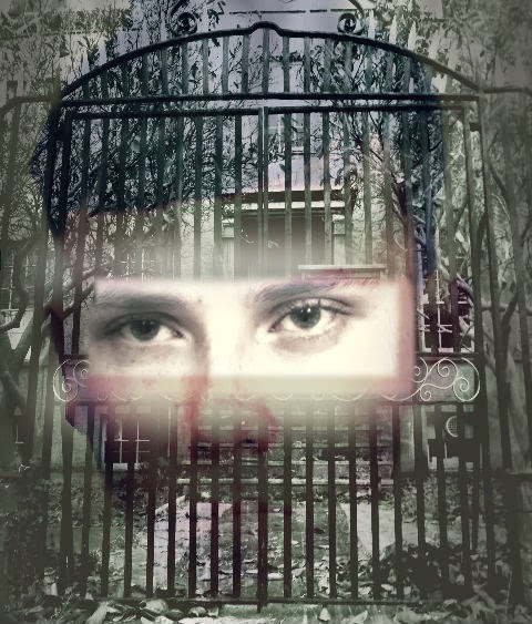
I began using PhotoShop to create a poster image using Sean and the Asylum. I began by layering the image of Sean underneath the asylum photo. I then used the lassoo tool to remove part of the asylum to reveal Sean's eyes underneath.


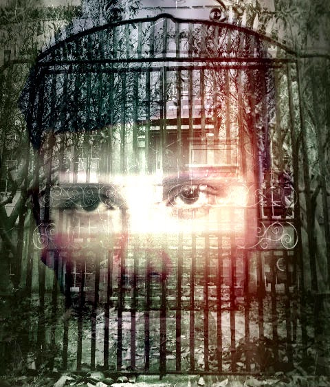
Obviously this was initially too square and un-professional looking but by feathering, blurring and fading I managed to make the edges softer to create a more ghostly effect. I also overlayed a scratched effect which made the paper appear as though it had been clawed at, and a red "ink leak" to make it look more menacing.


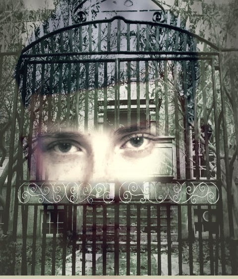
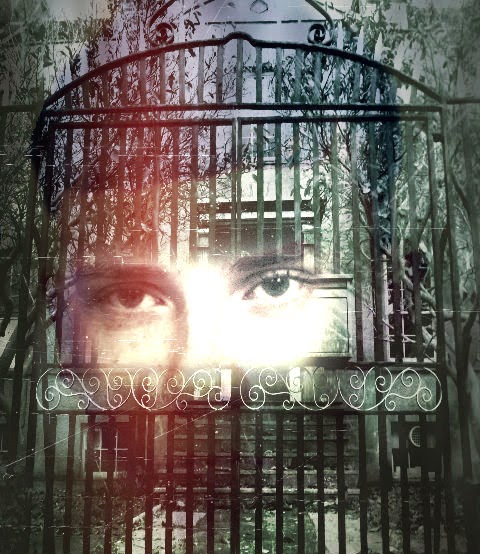
In the later versions, there is more careful blending of the eyes in the asylum gates:


I was finally happy with this image, to insert using adobe bridge into my original poster template:


Wednesday 12 March 2014

Editing my poster


 I came up with the idea of fading the image of the asylum into the poster, as I had originally wanted to use it, and feel that it is a key part of our plot. I hoped that by editing the asylum in, I could imply the idea of Cecilia being forever "enclosed" or bound to the asylum. I used photoshop and pixlr to merge the image over my previous image of Cecilia.


I added transparency to the asylum image so that it didn't look like too harsh a contrast between them and the image of Cecilia. I also initially liked the idea of it looking like a "ghostly" effect as it seemed to fade into the background. I also created a shadow effect behind Cecilia which made the outline look more ghostly. I then worked on changing the text slightly as it appeared too small and bunched up at the top of the page.


I made the tagline text more central in order to make sure the upper section didn't look too bare. I wanted it to move diagonally down the page in order to add to the faded effect, I lifted this style of positioning from "the ring" poster, where the text is disjointed across the page , which creates more of an effect as you read it.


Wednesday 5 March 2014

Making Improvements


I tried to incorporate the suggested changes into my designing process. I found it difficult to find an appropriate image of Sean to put into the background, as full body images didn't fit properly into the frame. They also clashed with parts of the gate and didn't align properly. I instead decided to photoshop an image of Sean's face to see if I could fade it into the background.


This was my initial attempt of removing the background. I then tried a number of effects to make his appearance look more threatening/haunting. 


I liked how this effect made his face appear more pale and changed the contrast to look more haunting. It seemed to intensify his expression and his eyes but I still wanted to feather the outline more.


I removed more of the image so that I was left with only the face. I then feathered and blurred the edges to make the outline look smoother. I uploaded the image into pixlr and tried some effects such as changing hue and contrast. I then used a smoke effect again which created the shadows around the edge of his face. I really liked this and considered trying to insert the image of Sean into a different poster design, similar to the way Leonardo DiCaprio's face is faded into the "shutter island" poster:


Obviously I didn't aim for my poster to be quite as professional as this, but I did like the idea of incorporating Sean's face over the asylum , I felt that this might create quite a scary image which might have been more striking than my initial poster idea.


Photo editing (continued)


During the animatic process I had photographed some exterior shots of the building in case I wanted to use them later on to blog or potentially as a poster image. Originally the picture was in colour, and whilst the gates still looked striking I wanted to edit it so it would appear more intimidating, and create more of a horror effect. I thought that by making the gates stand out more I could hopefully imply that the building was an asylum, especially with the trees either side and the steps leading up to the front door.

I transferred the photo into black and white , which was both a connotation of the fact our film is set in the past and gives the building an older lunatic asylum type appearance. This also made the fallen leaves stand out more, implying that it's set in Winter, and overall makes the exterior look more gloomy. I changed the contrast levels so that the gates became really dark in colour, and the door was more noticeable (as it was previously green which merged more into the rest of the building.) 
I liked this image for a horror poster, and did contemplate using it by itself, as some posters such as "Silent House" and "My Amityville Horror", focus solely on the location as their USP.


Using effects

I also edited this image using photoshop in case as an alternative to the one of Cecilia looking distressed, this image makes her look more powerful/determined. I wasn't as keen to use this however as I felt the image was too "happy" to be used on my poster.


I used "pixlr", an online editing site to use effects on my photos. I tried out a number of initial effects, such as the addition of "smoke" on the photo on the right. I also tried the film reel effect, I liked how it enhanced the image and gave the wood a grainy, stained effect. I felt that it did appear to reflect a horror genre but not enough to make it look visually effective. I knew I needed something to make it look slightly spookier/ hint at the psychological thriller genre.


Editing Photos


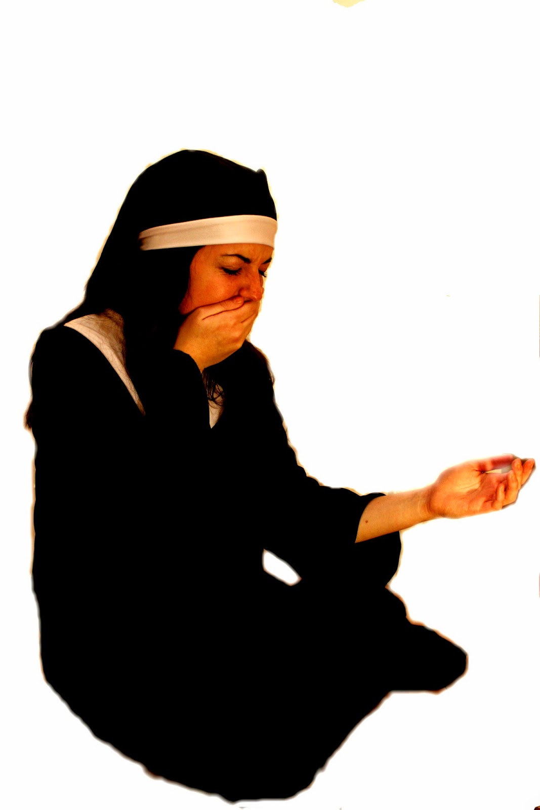
I felt that these were the two most powerful images to work with. I particularly like the first one as the pose of Cecilia is clearly distressed and she looks devastated, mirroring how she would feel being separated from her child. I wanted to use images of Cecilia as she is a primary character, and her character faces the worst circumstances throughout the narrative. We want the audience to feel sympathy and side with her from the very beginning and so its important that she is presented in this way. The second picture focuses more on the religious connotations of her character, as she is posed in a way that makes her appear to almost be praying, and more clearly displays her nun costume and crucifix necklace.


I decided to work on firstly photoshopping the images to see what effects I could create and remove the background to give me only the figure to work with.


I used the lassoo tool on photoshop in order to remove the background, and then the feather tool to blend the edges into the white background. I was then left purely with the figure to work on/edit against different backgrounds.