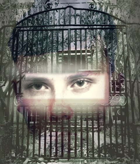
I began using PhotoShop to create a poster image using Sean and the Asylum. I began by layering the image of Sean underneath the asylum photo. I then used the lassoo tool to remove part of the asylum to reveal Sean's eyes underneath.

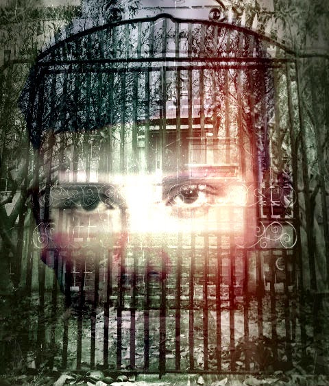
Obviously this was initially too square and un-professional looking but by feathering, blurring and fading I managed to make the edges softer to create a more ghostly effect. I also overlayed a scratched effect which made the paper appear as though it had been clawed at, and a red "ink leak" to make it look more menacing.

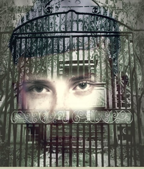
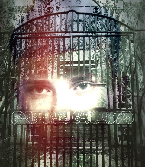
In the later versions, there is more careful blending of the eyes in the asylum gates:

I was finally happy with this image, to insert using adobe bridge into my original poster template:

No comments:
Post a Comment