Wednesday, 12 March 2014

Editing my poster


 I came up with the idea of fading the image of the asylum into the poster, as I had originally wanted to use it, and feel that it is a key part of our plot. I hoped that by editing the asylum in, I could imply the idea of Cecilia being forever "enclosed" or bound to the asylum. I used photoshop and pixlr to merge the image over my previous image of Cecilia.


I added transparency to the asylum image so that it didn't look like too harsh a contrast between them and the image of Cecilia. I also initially liked the idea of it looking like a "ghostly" effect as it seemed to fade into the background. I also created a shadow effect behind Cecilia which made the outline look more ghostly. I then worked on changing the text slightly as it appeared too small and bunched up at the top of the page.


I made the tagline text more central in order to make sure the upper section didn't look too bare. I wanted it to move diagonally down the page in order to add to the faded effect, I lifted this style of positioning from "the ring" poster, where the text is disjointed across the page , which creates more of an effect as you read it.




Wednesday, 5 March 2014

Making Improvements


I tried to incorporate the suggested changes into my designing process. I found it difficult to find an appropriate image of Sean to put into the background, as full body images didn't fit properly into the frame. They also clashed with parts of the gate and didn't align properly. I instead decided to photoshop an image of Sean's face to see if I could fade it into the background.


This was my initial attempt of removing the background. I then tried a number of effects to make his appearance look more threatening/haunting. 


I liked how this effect made his face appear more pale and changed the contrast to look more haunting. It seemed to intensify his expression and his eyes but I still wanted to feather the outline more.


I removed more of the image so that I was left with only the face. I then feathered and blurred the edges to make the outline look smoother. I uploaded the image into pixlr and tried some effects such as changing hue and contrast. I then used a smoke effect again which created the shadows around the edge of his face. I really liked this and considered trying to insert the image of Sean into a different poster design, similar to the way Leonardo DiCaprio's face is faded into the "shutter island" poster:


Obviously I didn't aim for my poster to be quite as professional as this, but I did like the idea of incorporating Sean's face over the asylum , I felt that this might create quite a scary image which might have been more striking than my initial poster idea.


Photo editing (continued)


During the animatic process I had photographed some exterior shots of the building in case I wanted to use them later on to blog or potentially as a poster image. Originally the picture was in colour, and whilst the gates still looked striking I wanted to edit it so it would appear more intimidating, and create more of a horror effect. I thought that by making the gates stand out more I could hopefully imply that the building was an asylum, especially with the trees either side and the steps leading up to the front door.

I transferred the photo into black and white , which was both a connotation of the fact our film is set in the past and gives the building an older lunatic asylum type appearance. This also made the fallen leaves stand out more, implying that it's set in Winter, and overall makes the exterior look more gloomy. I changed the contrast levels so that the gates became really dark in colour, and the door was more noticeable (as it was previously green which merged more into the rest of the building.) 
I liked this image for a horror poster, and did contemplate using it by itself, as some posters such as "Silent House" and "My Amityville Horror", focus solely on the location as their USP.


Using effects

I also edited this image using photoshop in case as an alternative to the one of Cecilia looking distressed, this image makes her look more powerful/determined. I wasn't as keen to use this however as I felt the image was too "happy" to be used on my poster.


I used "pixlr", an online editing site to use effects on my photos. I tried out a number of initial effects, such as the addition of "smoke" on the photo on the right. I also tried the film reel effect, I liked how it enhanced the image and gave the wood a grainy, stained effect. I felt that it did appear to reflect a horror genre but not enough to make it look visually effective. I knew I needed something to make it look slightly spookier/ hint at the psychological thriller genre.


Editing Photos


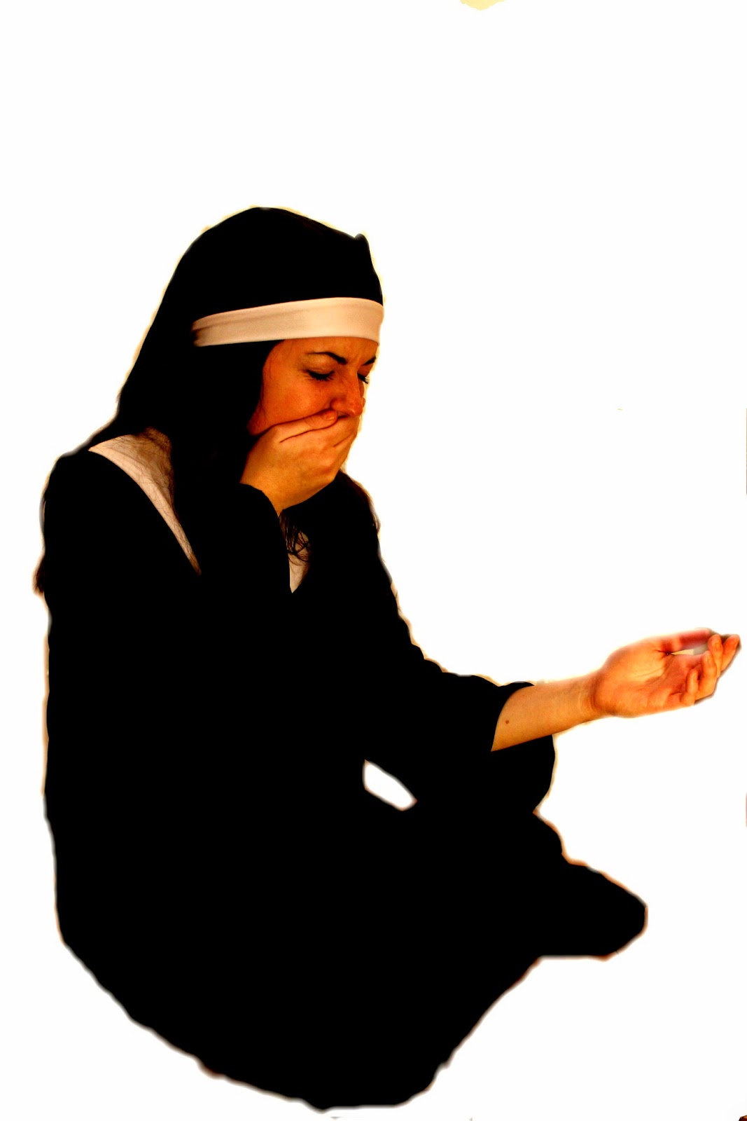
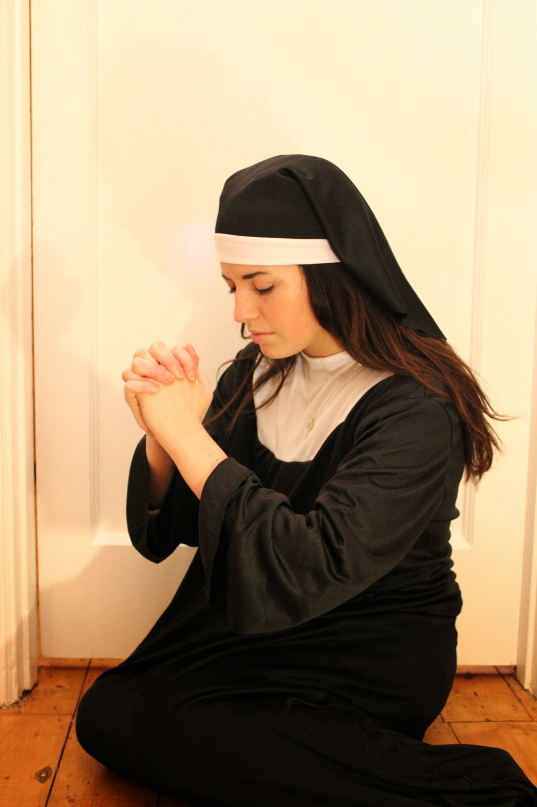
I felt that these were the two most powerful images to work with. I particularly like the first one as the pose of Cecilia is clearly distressed and she looks devastated, mirroring how she would feel being separated from her child. I wanted to use images of Cecilia as she is a primary character, and her character faces the worst circumstances throughout the narrative. We want the audience to feel sympathy and side with her from the very beginning and so its important that she is presented in this way. The second picture focuses more on the religious connotations of her character, as she is posed in a way that makes her appear to almost be praying, and more clearly displays her nun costume and crucifix necklace.


I decided to work on firstly photoshopping the images to see what effects I could create and remove the background to give me only the figure to work with.


I used the lassoo tool on photoshop in order to remove the background, and then the feather tool to blend the edges into the white background. I was then left purely with the figure to work on/edit against different backgrounds.


Saturday, 1 March 2014

First draft film poster


This was the first draft of my film poster. I began making a general poster template on Indesign with the film title, tagline and billing block. I used the font "Trajan Pro" to create the film title, this had an effect which gave points to the lettering and looked effective for reflecting a horror genre. I found that this font was similar to those in: 


Both of these posters use a stylistically similar font, also in a red colouring which has clear connotations with blood and gore. My other group members have also used the same font in order to give the feeling of being a "brand" or real production. We have also all used the same billing block , with the official billing block template which Harri (group member) managed to find online. By doing this we were able to make it as conventionally similar as possible to real posters.
I also added the social networking icons of "facebook" and "twitter" and well as the #trend in order to promote the film. This is a marketing technique which most recent film posters use in order to get the public talking about the film, which self-promotes it. I used the release date of "October" in order to relate to Halloween, and also because I wanted it to be set in a Winter month.


The tagline, "the past will always haunt you," is specifically relate- able to our film because it reflects the idea of Cecilia never being able to escape from her past. The memories of her father and his evil in the asylum will always surround her, and when Harri calls her in an effort to re-unite with her son, she is forced return to the asylum (where she was raped) knowing that it will anger her father, in a desperate attempt to save her son.

Obviously in this first draft there is a great deal of blank space with which I had to decide what to add into my poster.

Poster Images....