Sunday 30 March 2014

Poster designing

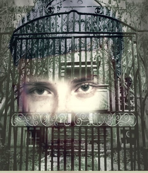
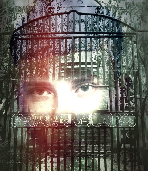
I also created a few extra versions of my poster in the designing process: 


I liked this design, but I couldn't get it to fit proportionally. As you can see Sean's face appears stretched and I felt that there was too great a colour contrast between Sean&Cecilia. I felt that due to this I couldn't use the image as my final submission.


This was another design. I preferred the editing of this, and was happy with the proportions. I liked the faded effect of Sean's face and how it merged into the building. I still felt however that the poster in general wasn't scary enough.

Friday 28 March 2014

Finding a new location...


As a group we began discussing potential new locations. We felt that this would be more productive than waiting for possible dates to film at Mulberry house which our actors may not have been able to make, (especially if we were only given one day to complete everything.)

We started doing extra research of local locations, and discussing whether they would be appropriate, and what their advantages and disadvantages would be. We concluded on three main realistic locations, and contacted all of them. These were:


The Drama Centre

This building is just down the road from Mulberry House. It was one of our original considerations, but at the time we contacted, nobody was available. The building is large, spacious and also has period features. It is open regularly as more of a public building, so we felt that this would be good in terms of easily arranging filming dates which could last all day. 


The Hill college mansion house
The Hill college is directly behind our school , which again would be perfect for accessibility. As a college, it has shut down and the building remains unused except for occasional venue hire. We hoped that this would perhaps mean that the owners/ whoever is now responsible for the building, would allow us to film there just for a day or two. The grand exterior would have been perfect for some extra exterior asylum shots, and the corridors inside the college building would have created a good representation for corridors in a mental hospital. We decided that this building would be the most ideal choice, and so called numerous numbers to find out who was now responsible for the site. It was difficult to gain permission as Coleg Gwent are still responsible overall for the buildings. 


The Skirrid Inn
The Skirrid Inn has a massive reputation in Wales as one of the most haunted places in Britain. There are multiple stories about ghosts and hauntings as the building is so old. For this reason, we felt that the old features would create really effective mise-en-scene and create an overall creepy atmosphere. There is also an old stairwell which has an authentic noose hanging from the beam, where people had genuinely been hanged in the past. We felt that this might add some realism and clearly it was the perfect pre-set prop for a horror scene. It was however, the furthest away location and most difficult to access. We made calls to the Skirrid Inn but it was problematic asking for any more than an hour or two, and we were asked for payment to use the building for any longer than this time. As a result, we dismissed this location as a possibility, as it would also mean arranging transport for our actors and would limit our time.




Thursday 27 March 2014

Location problems

Managing time with regards to filming has been difficult for our group as a result of problems with our chosen location. We originally made a shooting schedule, planning to have all of our filming done within three weeks. We were told however that we would have to postpone this by a month due to building work on Mulberry house.

We were initially prepared for this to be an issue as we were warned about it whilst shooting the animatic. In this regard, it was a shame that we weren't allowed to do any filming at the time we were photographing the animatic. At that time, the building had more of its original period features which added to our mise-en-scene, as our film is set in the past. When we were able to film we were slightly disappointed by the changes that had been made in the building, but at least we were still able to film in the cellar, conference room and canteen and chapel. We managed to shoot scenes of Harri (the psychiatrist) being led into the building up the steps, the interview scenes, and some patient scenes. We filmed Rachael as an extra patient, as well as a shot of Sean having a fit of anger in his room. We were also able to film Gethin being threatened by a knife,as he is one of Sean's suspects, (sean believes that Gethin is withholding information from him, and siding with the head of the asylum.)

It seemed positive when we were able to secure the first few filming sessions, but soon there were problems arranging dates again, due to building contractors and health and safety supervisors.
In order to meet our deadline and get as much footage as possible, we decided to find a new location, whilst editing the footage we already had.

Wednesday 19 March 2014

Poster Presentation

I created a short presentation on my poster to show my Media Studies class. I used Prezi to explain the reasons for choosing the style and image of my poster, and discuss the conventions I have conformed to or challenged. I hoped that this would help me to gain some feedback and constructive criticism.


Friday 14 March 2014

Poster Process

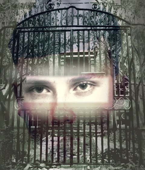
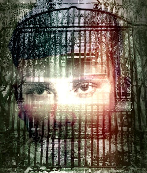
I began using PhotoShop to create a poster image using Sean and the Asylum. I began by layering the image of Sean underneath the asylum photo. I then used the lassoo tool to remove part of the asylum to reveal Sean's eyes underneath.


Obviously this was initially too square and un-professional looking but by feathering, blurring and fading I managed to make the edges softer to create a more ghostly effect. I also overlayed a scratched effect which made the paper appear as though it had been clawed at, and a red "ink leak" to make it look more menacing.


In the later versions, there is more careful blending of the eyes in the asylum gates:


I was finally happy with this image, to insert using adobe bridge into my original poster template:


Wednesday 12 March 2014

Editing my poster


 I came up with the idea of fading the image of the asylum into the poster, as I had originally wanted to use it, and feel that it is a key part of our plot. I hoped that by editing the asylum in, I could imply the idea of Cecilia being forever "enclosed" or bound to the asylum. I used photoshop and pixlr to merge the image over my previous image of Cecilia.


I added transparency to the asylum image so that it didn't look like too harsh a contrast between them and the image of Cecilia. I also initially liked the idea of it looking like a "ghostly" effect as it seemed to fade into the background. I also created a shadow effect behind Cecilia which made the outline look more ghostly. I then worked on changing the text slightly as it appeared too small and bunched up at the top of the page.


I made the tagline text more central in order to make sure the upper section didn't look too bare. I wanted it to move diagonally down the page in order to add to the faded effect, I lifted this style of positioning from "the ring" poster, where the text is disjointed across the page , which creates more of an effect as you read it.


Wednesday 5 March 2014

Making Improvements


I tried to incorporate the suggested changes into my designing process. I found it difficult to find an appropriate image of Sean to put into the background, as full body images didn't fit properly into the frame. They also clashed with parts of the gate and didn't align properly. I instead decided to photoshop an image of Sean's face to see if I could fade it into the background.


This was my initial attempt of removing the background. I then tried a number of effects to make his appearance look more threatening/haunting. 


I liked how this effect made his face appear more pale and changed the contrast to look more haunting. It seemed to intensify his expression and his eyes but I still wanted to feather the outline more.


I removed more of the image so that I was left with only the face. I then feathered and blurred the edges to make the outline look smoother. I uploaded the image into pixlr and tried some effects such as changing hue and contrast. I then used a smoke effect again which created the shadows around the edge of his face. I really liked this and considered trying to insert the image of Sean into a different poster design, similar to the way Leonardo DiCaprio's face is faded into the "shutter island" poster:


Obviously I didn't aim for my poster to be quite as professional as this, but I did like the idea of incorporating Sean's face over the asylum , I felt that this might create quite a scary image which might have been more striking than my initial poster idea.


Photo editing (continued)


During the animatic process I had photographed some exterior shots of the building in case I wanted to use them later on to blog or potentially as a poster image. Originally the picture was in colour, and whilst the gates still looked striking I wanted to edit it so it would appear more intimidating, and create more of a horror effect. I thought that by making the gates stand out more I could hopefully imply that the building was an asylum, especially with the trees either side and the steps leading up to the front door.

I transferred the photo into black and white , which was both a connotation of the fact our film is set in the past and gives the building an older lunatic asylum type appearance. This also made the fallen leaves stand out more, implying that it's set in Winter, and overall makes the exterior look more gloomy. I changed the contrast levels so that the gates became really dark in colour, and the door was more noticeable (as it was previously green which merged more into the rest of the building.) 
I liked this image for a horror poster, and did contemplate using it by itself, as some posters such as "Silent House" and "My Amityville Horror", focus solely on the location as their USP.


Using effects

I also edited this image using photoshop in case as an alternative to the one of Cecilia looking distressed, this image makes her look more powerful/determined. I wasn't as keen to use this however as I felt the image was too "happy" to be used on my poster.


I used "pixlr", an online editing site to use effects on my photos. I tried out a number of initial effects, such as the addition of "smoke" on the photo on the right. I also tried the film reel effect, I liked how it enhanced the image and gave the wood a grainy, stained effect. I felt that it did appear to reflect a horror genre but not enough to make it look visually effective. I knew I needed something to make it look slightly spookier/ hint at the psychological thriller genre.


Editing Photos


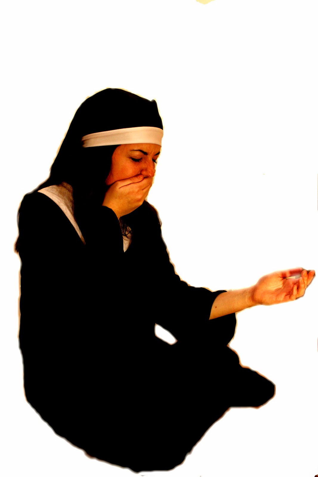
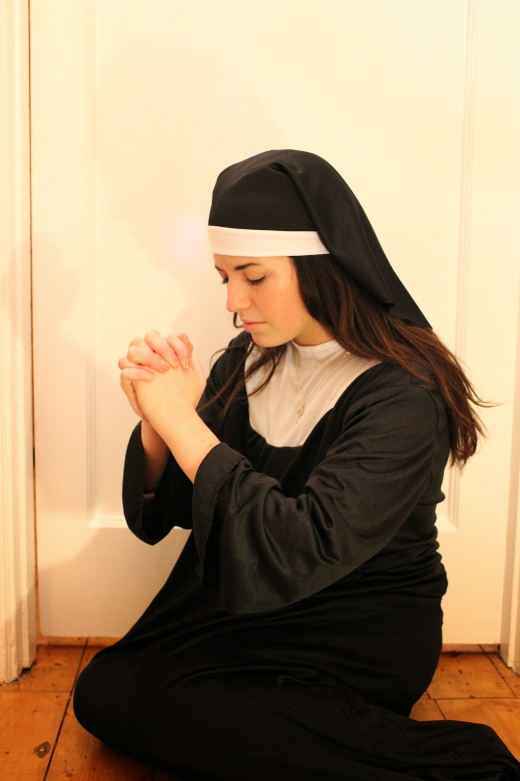
I felt that these were the two most powerful images to work with. I particularly like the first one as the pose of Cecilia is clearly distressed and she looks devastated, mirroring how she would feel being separated from her child. I wanted to use images of Cecilia as she is a primary character, and her character faces the worst circumstances throughout the narrative. We want the audience to feel sympathy and side with her from the very beginning and so its important that she is presented in this way. The second picture focuses more on the religious connotations of her character, as she is posed in a way that makes her appear to almost be praying, and more clearly displays her nun costume and crucifix necklace.


I decided to work on firstly photoshopping the images to see what effects I could create and remove the background to give me only the figure to work with.


I used the lassoo tool on photoshop in order to remove the background, and then the feather tool to blend the edges into the white background. I was then left purely with the figure to work on/edit against different backgrounds.


Saturday 1 March 2014

First draft film poster


This was the first draft of my film poster. I began making a general poster template on Indesign with the film title, tagline and billing block. I used the font "Trajan Pro" to create the film title, this had an effect which gave points to the lettering and looked effective for reflecting a horror genre. I found that this font was similar to those in: 


Both of these posters use a stylistically similar font, also in a red colouring which has clear connotations with blood and gore. My other group members have also used the same font in order to give the feeling of being a "brand" or real production. We have also all used the same billing block , with the official billing block template which Harri (group member) managed to find online. By doing this we were able to make it as conventionally similar as possible to real posters.
I also added the social networking icons of "facebook" and "twitter" and well as the #trend in order to promote the film. This is a marketing technique which most recent film posters use in order to get the public talking about the film, which self-promotes it. I used the release date of "October" in order to relate to Halloween, and also because I wanted it to be set in a Winter month.


The tagline, "the past will always haunt you," is specifically relate- able to our film because it reflects the idea of Cecilia never being able to escape from her past. The memories of her father and his evil in the asylum will always surround her, and when Harri calls her in an effort to re-unite with her son, she is forced return to the asylum (where she was raped) knowing that it will anger her father, in a desperate attempt to save her son.

Obviously in this first draft there is a great deal of blank space with which I had to decide what to add into my poster.

Poster Images....