Tuesday, 8 April 2014

Magazine drafting

 This was my first initial magazine design, giving a rough idea of the layout and image I wanted to use. I named my film magazine, "Premiere" which has obvious connotations with film premieres, suggesting exclusive first-hand access to new films. I have used a bold masthead font, and decided to make the issue a "horror special," rather than attempting to create a magazine which specialises in the genre, as these are uncommon. I have used additional images to add to its authenticity and began to add coverlines and stories.


For this draft I tried using a horror wallpaper background behind the masthead. I liked the idea of it, but clearly if I wished to use it in my submission, I would need to fade and feather to contrast between this image, and the main image of Harri. The image of Harri (the psychiatrist character), was created using Photoshop, where I removed the background and added red ink stains to create a bloodstain effect. However, I feel after some deliberation that the image is not effective enough , as the quality is not as clear as I would like it to be. It does not seem striking enough for a front cover image, and I don't feel that it clearly defines the genre enough.

Saturday, 5 April 2014

New location!

I called the drama centre to explain our plans and ask if filming there would be a possibility, the staff were extremely helpful and offered for me to meet them the following day. At the meeting, they informed me that the centre was open most days, all day, and that we could film any time they were open. This was extremely relieving after having to work on limited hours, on specific dates. The interior was really useful for our trailer, with a cellar, corridors, and eerie looking outside prop sheds. We were also given access to the props department, which some brilliant props for our trailer. Lanterns, candles, fake guns and a wheelchair were among just a few which really helped authenticate our mise-en-scene. We were also able to add extra scenes to our storyboard which otherwise wouldn't have been possible without those specific props, such as a gun being pulled from the draw, and a man hanging from a rope. These definitely helped to add and emphasise to the horror aspect of our psychological thriller. The wardrobe department and costumes were also offered to us , which was particularly helpful as again, there were lots of older style costumes to help add to the representation of the film being set in the past.

Sunday, 30 March 2014

Poster designing

I also created a few extra versions of my poster in the designing process: 


I liked this design, but I couldn't get it to fit proportionally. As you can see Sean's face appears stretched and I felt that there was too great a colour contrast between Sean&Cecilia. I felt that due to this I couldn't use the image as my final submission.


This was another design. I preferred the editing of this, and was happy with the proportions. I liked the faded effect of Sean's face and how it merged into the building. I still felt however that the poster in general wasn't scary enough.

Friday, 28 March 2014

Finding a new location...


As a group we began discussing potential new locations. We felt that this would be more productive than waiting for possible dates to film at Mulberry house which our actors may not have been able to make, (especially if we were only given one day to complete everything.)

We started doing extra research of local locations, and discussing whether they would be appropriate, and what their advantages and disadvantages would be. We concluded on three main realistic locations, and contacted all of them. These were:


The Drama Centre

This building is just down the road from Mulberry House. It was one of our original considerations, but at the time we contacted, nobody was available. The building is large, spacious and also has period features. It is open regularly as more of a public building, so we felt that this would be good in terms of easily arranging filming dates which could last all day. 


The Hill college mansion house
The Hill college is directly behind our school , which again would be perfect for accessibility. As a college, it has shut down and the building remains unused except for occasional venue hire. We hoped that this would perhaps mean that the owners/ whoever is now responsible for the building, would allow us to film there just for a day or two. The grand exterior would have been perfect for some extra exterior asylum shots, and the corridors inside the college building would have created a good representation for corridors in a mental hospital. We decided that this building would be the most ideal choice, and so called numerous numbers to find out who was now responsible for the site. It was difficult to gain permission as Coleg Gwent are still responsible overall for the buildings. 


The Skirrid Inn
The Skirrid Inn has a massive reputation in Wales as one of the most haunted places in Britain. There are multiple stories about ghosts and hauntings as the building is so old. For this reason, we felt that the old features would create really effective mise-en-scene and create an overall creepy atmosphere. There is also an old stairwell which has an authentic noose hanging from the beam, where people had genuinely been hanged in the past. We felt that this might add some realism and clearly it was the perfect pre-set prop for a horror scene. It was however, the furthest away location and most difficult to access. We made calls to the Skirrid Inn but it was problematic asking for any more than an hour or two, and we were asked for payment to use the building for any longer than this time. As a result, we dismissed this location as a possibility, as it would also mean arranging transport for our actors and would limit our time.




Thursday, 27 March 2014

Location problems

Managing time with regards to filming has been difficult for our group as a result of problems with our chosen location. We originally made a shooting schedule, planning to have all of our filming done within three weeks. We were told however that we would have to postpone this by a month due to building work on Mulberry house.

We were initially prepared for this to be an issue as we were warned about it whilst shooting the animatic. In this regard, it was a shame that we weren't allowed to do any filming at the time we were photographing the animatic. At that time, the building had more of its original period features which added to our mise-en-scene, as our film is set in the past. When we were able to film we were slightly disappointed by the changes that had been made in the building, but at least we were still able to film in the cellar, conference room and canteen and chapel. We managed to shoot scenes of Harri (the psychiatrist) being led into the building up the steps, the interview scenes, and some patient scenes. We filmed Rachael as an extra patient, as well as a shot of Sean having a fit of anger in his room. We were also able to film Gethin being threatened by a knife,as he is one of Sean's suspects, (sean believes that Gethin is withholding information from him, and siding with the head of the asylum.)

It seemed positive when we were able to secure the first few filming sessions, but soon there were problems arranging dates again, due to building contractors and health and safety supervisors.
In order to meet our deadline and get as much footage as possible, we decided to find a new location, whilst editing the footage we already had.

Wednesday, 19 March 2014

Poster Presentation

I created a short presentation on my poster to show my Media Studies class. I used Prezi to explain the reasons for choosing the style and image of my poster, and discuss the conventions I have conformed to or challenged. I hoped that this would help me to gain some feedback and constructive criticism.


Friday, 14 March 2014

Poster Process

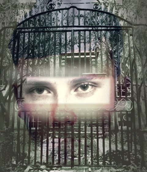
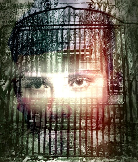
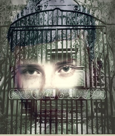
I began using PhotoShop to create a poster image using Sean and the Asylum. I began by layering the image of Sean underneath the asylum photo. I then used the lassoo tool to remove part of the asylum to reveal Sean's eyes underneath.


Obviously this was initially too square and un-professional looking but by feathering, blurring and fading I managed to make the edges softer to create a more ghostly effect. I also overlayed a scratched effect which made the paper appear as though it had been clawed at, and a red "ink leak" to make it look more menacing.


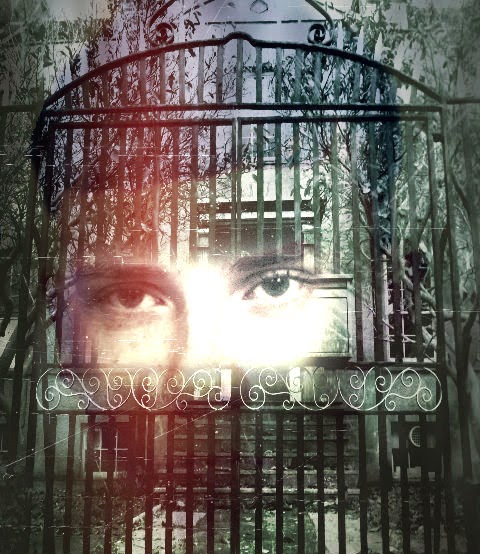
In the later versions, there is more careful blending of the eyes in the asylum gates:


I was finally happy with this image, to insert using adobe bridge into my original poster template: